

Image 1: Harley Weir Photography
I have always loved Harley weir ability to capture her subjects in unique positions. Her images are often include a glaze, Lomography effect in pastel colours. I have always been drawn to her ability to exude emotion from her subjects through lighting, colour scheme and position.

Image 2: Tutorial Gesture Drawing
The technique used in today’s class was gesture drawing. We were draw our tutors position, using soft, fluid drawing technique. The idea is to grasp the an outline or the movement and shape of the subject, and to teach us as students our to draw to objects and become more familiar with realistic drawing. The challenges I faced when completing this exercise was trying to draw with a light grip and instead of using my forearm to draw, trying to become familiar with drawing using my wrist.

Image 3: Life cycle of an orange
This image was created using an iphone photography. The set was created by placing light pink tissue paper against a wall on the floor, and then place an uncut orange on a white plate. Once I found took a photo of the uncut orange I cut and ate the rest and then shot the peels. When creating this image I was influenced by Petra collins style photography, and wanted to include pastel colours and create the double exposure effect. In photoshop the image’s brightness and contrast were enhanced and a solid overlay of a subtle yellow was used to create the ‘vintage’ effect. To create the double exposure effect I overlaid the uncut orange image. The final product was not as clean as I had hoped and this is likely due to the use of an iphone instead of a DSLR camera.

Image 4: Popart scientific drawing of a flower
This image was created by drawing this flower directly onto paper. The image was then transferred to a vector using adobe image trace, where it was pasted into photoshop. In photoshop the gradient tool was used to fill in parts of the flower, while the halftone pattern filter was used added to the background and the flower to achieve the pop-art effect. Finally the lasso and pink fill bucket was used to create the uneven pink stem fill. I was heavily influenced by Andy Warhol’s pop-art images which includes roughly filled in areas of colour on many of his pieces. Overall I am pleased with the final product, however I would have preferred this the pop-art effect was sensitive to shading of the image and adjusted the colour of the effect accordingly.

Image 5: Illustrated scientific drawing of a flower.
This flower was achieved similar to the one above, where I illustrated the image, converted it to a vector using illustrator and then copied across to photoshop. In photoshop I simply filled in each area using a selection of colours which are likely to found on flora. The idea was add colour to a scientific flower drawing, by adding colour to all aspects including the outline. I process was simple and produced an image which I am thoroughly happy with.

Image 6: Glitch Scientific drawing of a flower
Illustration was again used to produce the image. As used in the previous illustrations, the ‘Glitch’ image was hand drawn, transferred to a vector using Adobe illustrator and then pasted into Photoshop. To create the glitch effect, a pink and blue outline was added with a reduced opacity to create the overlapping effect. The smudge tool was then used and the image was cut in half and moved slightly to the right to achieve the look of the image being distorted. The background was created using a black and white version of the photoshop filter grain with the intensity increased. The idea behind the image was to combine two forms of science technology and the study of flora. I chose to make the image appear distorted as I felt it was an effective and a bold way to represent the ‘technology’.


Image 7: Brother Studying 1
This image was created using Black and white photojournalism. The photo captures the stress and exhaustion of my brother trying to do study for his exams. The image was edited in photoshop, using the brightness and contrast settings. I decided to capture this moment as I felt his body position, being slumped over the side of the chair, indicates he’s tired and had enough, while the books to the side suggest he is doing some form study or home work.

Image 8: Brother Studying 2
The photo was taken using Black and White photojournalism. The photo was edited by adjusting the brightness and contrast. A hot pink solid was overlaid onto the image and the yellow light effect was added by creating a eclipse and using to the radial gradient settings to fill it, which created soft addition of colour to the corner of the image. I was influenced by lomography style photography when editing the image and wanted to add and effect that mimic the style. I felt if the pink was slightly softer and not overlaid by instead multiplied onto the image, it may have appeared less forced and ‘edited’ and more of a natural lomography style photo.

Image 9: Brother studying 3
Photo was taken using Black and White photojournalism. In photoshop the images brightness and contrast were adjusted and a grain filter was added. The paint effect lines were added using the brush tool. The image was inspired by a collaboration between artists Britt Bass and Morgan Blake, which consisted of a black and white images of buildings being outlined in bright oranges and blues. The technique was effective and made the structure of the buildings standout. The three lines are being used to emphasise the my brother's position and his emotions.

Image 10: rm williams 1
The image was created using the technique of photojournalism. The brightness and contrast were edited in photoshop, to make the colours in the image more vibrant and less dull. I chose to photograph the shoes outside because their worn out exterior was the result of extensive wear conducted mostly outside. The idea of the worn out boot, coincides with the idea of being on many adventures and ‘experiencing life’. Overall the image could have been improved by better focus which could have been done by taking the image further away.

Image 11: RM williams 2
Black and white DLSR photography, the brightness, contrast and curves were adjusted in photoshop. The black and white enhances the image’s story and makes the image appear more memorable. Like the previous image, the focus could have been improved by taking the image from further away.

Image 12: Summer love
The image is a mixed media, as it combines photography and illustration. The image was captured on a DSLR camera and took into account the rule of thirds. The image was imported into photoshop where the brightness and contrast were adjusted. A solid orange and grain filter were added to the photo to produce a vintage style effect on the image. Because of the images innocent style I chose to illustrate to characters that appear to either be in love or are friends. The illustration style is messy and was draw using the paintbrush in photoshop. The messy style suits and a draws a connection to the innocence that is captured in the image. I chose not to include real people because I wanted to experiment with illustration and photography.


Image 13: ball dress
The comic strip follows the story of a girl who doesn’t have a solution for a ball dress, until her friend suggests an option. The strip was created using the traditional comic strip layout, which involves dialogue and illustrated characters, organised in boxes that are in sequential order. The story line has a beginning middle and end. Whilst I was happy enough with final product I believe the illustrations could have been more defined.
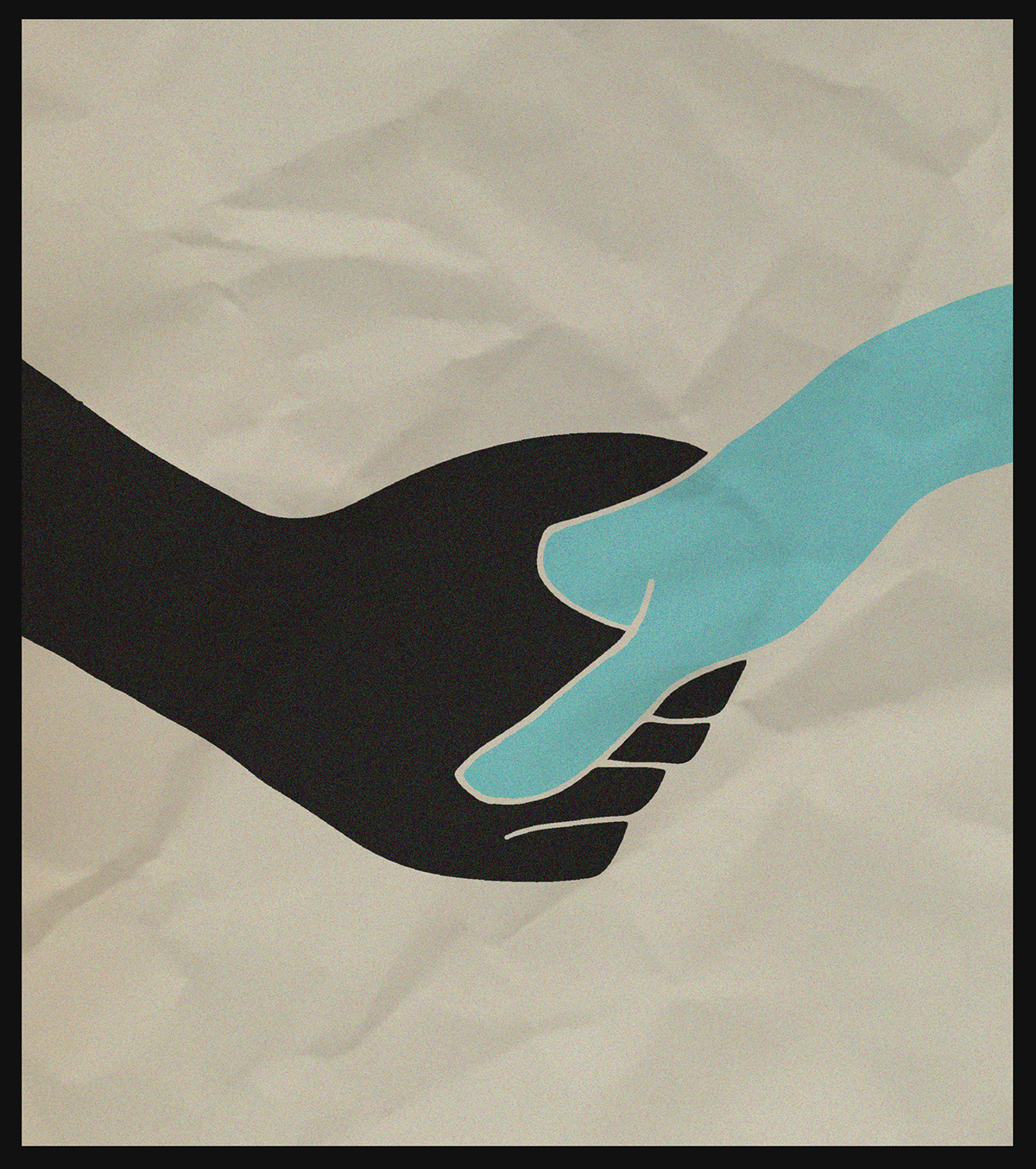
Image 14: Diversity
The image of two hands was created using an illustration technique. The hands were hand drawn, created into vectors using adobe illustrator and then edited in photoshop. The hands were filled using the fill bucket. The crinkled paper effect was created by scrunching up a piece of paper, taking a photo, importing into photoshop and then making the image multiply. The image is about creating a relationships with people who may be deemed a minority in our society or are hardly done by. I wanted the image to be simple so the message could be up for personal interpretation. However by using two different colours for the hands I am instigating that these people come from two different areas of society whether it be gender, race, religion or sexuality.

Image 15: Sully movie poster
Was created using typography and graphics. The image is a Movie Poster for the movie Sully, which covers the story of the Pilot who landed the plane in the hudson river. The image was created in photoshop. The halftone circle filter was added to the text to create a simplified digital effect. The transform tool was used to distort the characters to appears as though they were being sucked into the middle of the page. The blur tool was used to create the effect of movement on the text and the feathered brush tool was used to outline the each character to soften the image. The image exudes an element of panic within each character as they are each heavily distorted. Whilst the monochrome palette enhances the seriousness of story.

Image 16: The lips
The lips were created by hand drawing to female lips. The lips were created into vectors via Adobe Illustrator, then edited in Photoshop. Colour was added to the lips via the gradient tool. The line was then removed and the crinkled paper overlay was added (using the same image as used in the diversity image). The multiply effect was added to the overlay, as it appeared more realistic. I chose use multiple colours and the action of two female lips about to kiss as a representation of the LGBTQ community whose flag is rainbow. I felt this image was particularly topical in our current society with the marriage equality plebiscite. Graphical style for this image was inspired by a poster for OSLO created by Christina Magnussen.


Image 17: Tin Pattern
The image was created using DSLR photography. The camera settings were on an aperture of 14. The image is a closeup of a pattern on a tin found my kitchen. I was intrigued by the colours and shapes evident in the 60’s inspired print. The brightness, contrast and curves were edited heavily in photoshop to increase the level of viberantness and create an emphasis on the colours used in the pattern.

Image 18: Lip pattern
The lip graphic was drawn by hand and then created into a vector in illustrator. The image was imported into photoshop where it was changed to white. The black paint texture fill was created by using the photoshop paint brush. The blue outline was added to add interest to the image and disturb the pattern. The black was chosen as it stands out against the dark olive green background. It’s a colour that’s often not associated with the colour of lipstick.

Image 19: Texture
An image of the texture of the skin of an orange peel. It was taken using a DSLR camera, and was cropped in photoshop, to focus on the details of the skin. I was drawn to the shadow on the image and quality of the image.


Image 20: Self portrait
The image is an illustrated self portrait. It was drawn by hand and created into a vector then pasted into photoshop. I then draw using the mouse pad a rough outline over the illustration, to add messy/hand drawn element to the image. I chose an off white background, to dull the harsh contrast between the illustration and the background. The pupils have been removed to reduce to reduce the level of clutter on the page.

Image 21: Close up
The image is an illustration of an image that was taken. The image is an image that was taken of a friend. The image was dark and out of focus, however the concept had potential so I turned the image into a digital illustration. The illustration was drawn, created into a vector using Adobe Illustrator and then transferred to Photoshop, where the image was filled in using the paint bucket tool. The light pink background was chosen as it complimented highly the pastel coloured features. I wanted to draw the photo as the position and angle were unique and create a statement image.
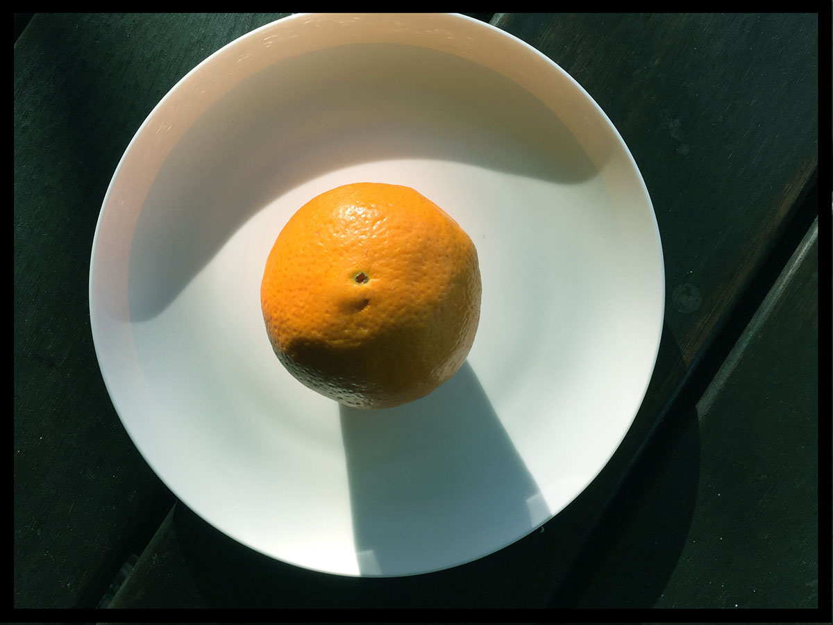
Image 22: The orange and plate 1
This image is an above view of an orange taken using a DSLR camera. When taking the image I was intrigued by the images unique shadows which create an interesting shape on plate. I also enjoyed the contrast between the dark brown wood of the table, the white plate and the vibrant of orange shade of the orange. The use of shape and position in addition contribute to the photos interesting composure. The image was editing in photoshop. The brightness and contrast were edited to create a more vibrant image, whilst cyan in the image was increased to create a slightly cooler toned image, to increase the emphasis on the orange.

Image 23: The orange and plate 2
This side view photo was taken using a DSLR camera. The image was taken at level with the table, so I could capture the light hitting the top of the orange. This image was edited using photoshop, where the brightness and contrast were adjusted and the Cyan level was increased, to create a more cool toned composition.
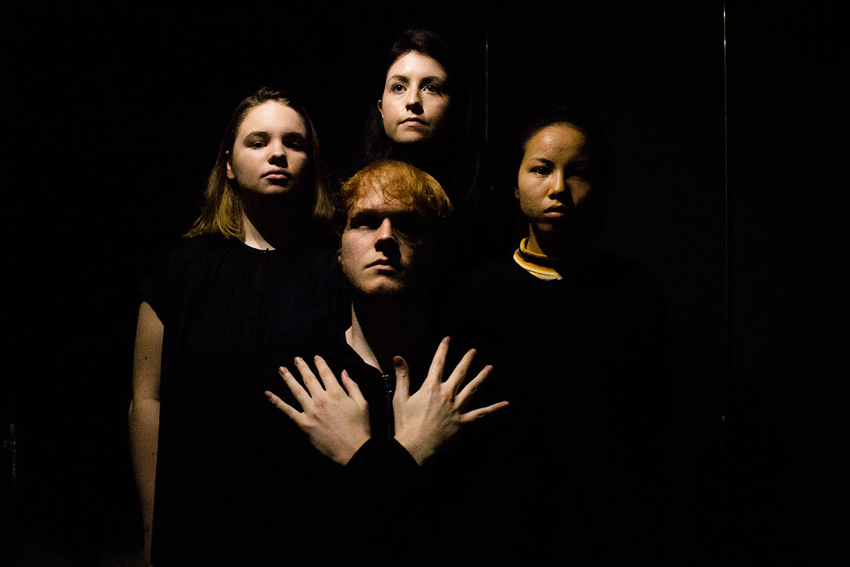
Image 24: Group tute photo
This image was created using a DSLR camera and three iphones to create light. The image was created as part of a tute activity where we were asked to recreate a Queen album cover. The light was placed above the heads, allowing the camera’s to capture an interesting composition where the focus is placed on the students faces. The photo was captured in a dark, room against a black backdrop enhancing the natural contrast between the body’s and the background. The image was edited using a canon application, where the brightness and contrast were adjusted and the magenta level increased, to enhance the focus on the faces. As result of the editing the noise level increased, however as the context of the assignment was to recreate an image taking during the 70’s, noise adding a subtle vintage effect to the image.

Image 25: Green Lighting Image
This image was created using a dslr camera, with white umbrella’s to soften the light and a green cloth over the light to add the green light effect. The photo was taken within a dark room against a solid black background. The brightness and contrast, and the green level in the image were all adjusted and increased in photoshop.


Image 26: Microphotography lego man 1
The technique used was microphotography, where the focus of the photo was on a mini creation. I created what was supposed to be two bushes out of broccoli, used a lego man as an adventurer and salt for the ground. The F-stop on the camera was increased to reduce drag and the aperture was reduced to 15. The image taken was from the waist up and didn’t capture any of the salt. The image was edited in photoshop where the brightness and contrast were adjusted. The saturation was increased as I wanted to dull out the composition and reduce the focus on areas like the head of the lego man.

Image 27: Microphotography lego man 2
The technique used was microphotography, where the focus of the photo was on a mini creation. I created what was supposed to be two bushes out of broccoli, used a lego man as an adventurer and salt for the ground. The F-stop on the camera was increased to reduce drag and the aperture was reduced to 15. The brightness and contrast was increased in photoshop. The vibrance of the image was increased in addition to the contrast, resulting in a more warm toned image.

Image 28: Microphotography lego man 2
The technique used was microphotography, where the focus of the photo was on a mini creation. I created what was supposed to be two bushes out of broccoli, used a lego man as an adventurer and salt for the ground. The F-stop on the camera was increased to reduce drag and the aperture was reduced to 15. A black and white overlay was added, with the opacity reduced to create a darker themed image. I feel like the effect wasn’t as effective as it could be.

Image 29: Microphotography lego man 3
The technique used was microphotography, where the focus of the photo was on a mini creation. I created what was supposed to be two bushes out of broccoli, used a lego man as an adventurer and salt for the ground. The F-stop on the camera was increased to reduce drag and the aperture was reduced to 15. Whilst this image is out of focus the contrast has been increased to increase the vibrancy of the bushes.

Image 30: Microphotography lego man 4
The technique used was microphotography, where the focus of the photo was on a mini creation. I created what was supposed to be two bushes out of broccoli, used a lego man as an adventurer and salt for the ground. The F-stop on the camera was increased to reduce drag and the aperture was reduced to 15. Only the brightness was adjusted for this image which resulted, in a duller composition than the previous images.

Image 31: Microphotography Lego Man 5
The technique used was microphotography, where the focus of the photo was on a mini creation. I created what was supposed to be two bushes out of broccoli, used a lego man as an adventurer and salt for the ground. The F-stop on the camera was increased to reduce drag and the aperture was reduced to 15. The black and white effect was added in photoshop, while the brightness and contrast were also adjusted.


